English article · Artículo en inglés
Hospitality Web Design: 5 Crucial Mistakes to Fix Now (and How to Turn Website Visitors into Bookings).
The five most common mistakes Restaurants, cafés and bars make on their websites — and the practical improvements that make information and contact easier to find.
Share
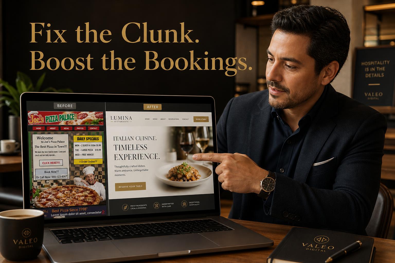
Illustrative website examples: clearer information can reduce friction, without guaranteeing bookings.
Your website is the busiest waiter in your venue. It works 24/7, greets every guest before they walk in, and can influence how clearly they understand your offer and contact options. There is no universal three-second decision time. These five common mistakes can make that decision harder. The good news: every one of them is fixable.
Mistake #1 — Hiding your menu inside a PDF
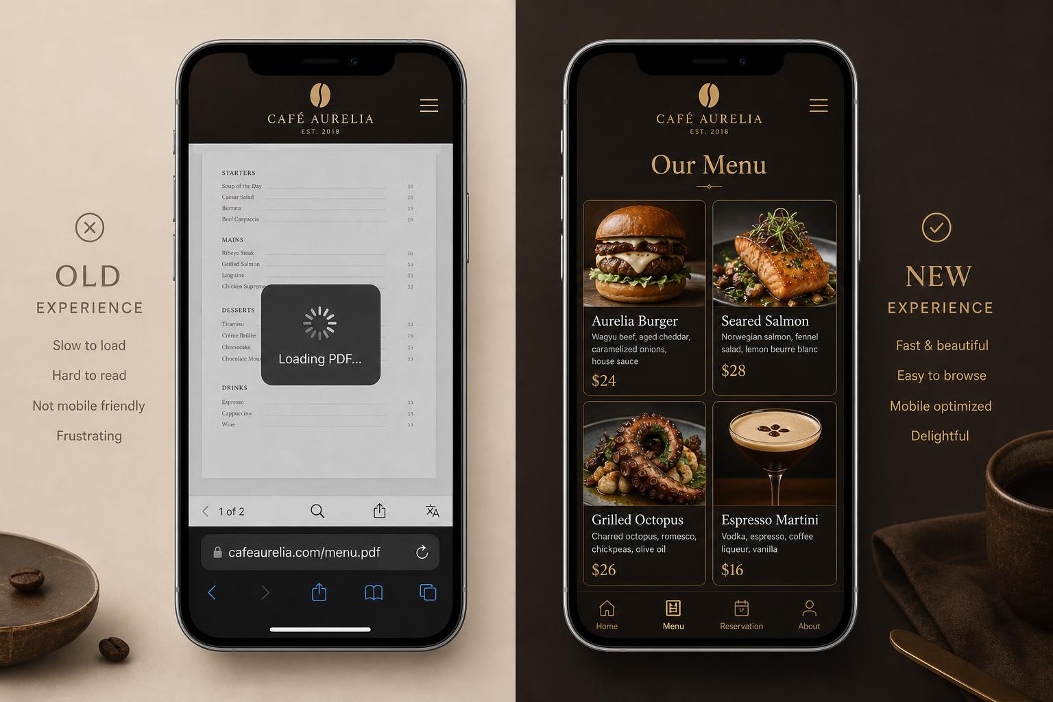
A PDF menu is the digital equivalent of handing a guest a laminated sheet, then walking away. Google can index PDFs, including text-based menus. But a large or poorly formatted PDF can be awkward on mobile, and HTML can make individual dishes and accessible navigation easier to maintain. Guests want to see the food before they commit.
The fix: a visual, mobile-first menu where each dish has its own photo, price and short description. See a live Visual Menu demo →
Mistake #2 — A "Book Now" button that goes nowhere good
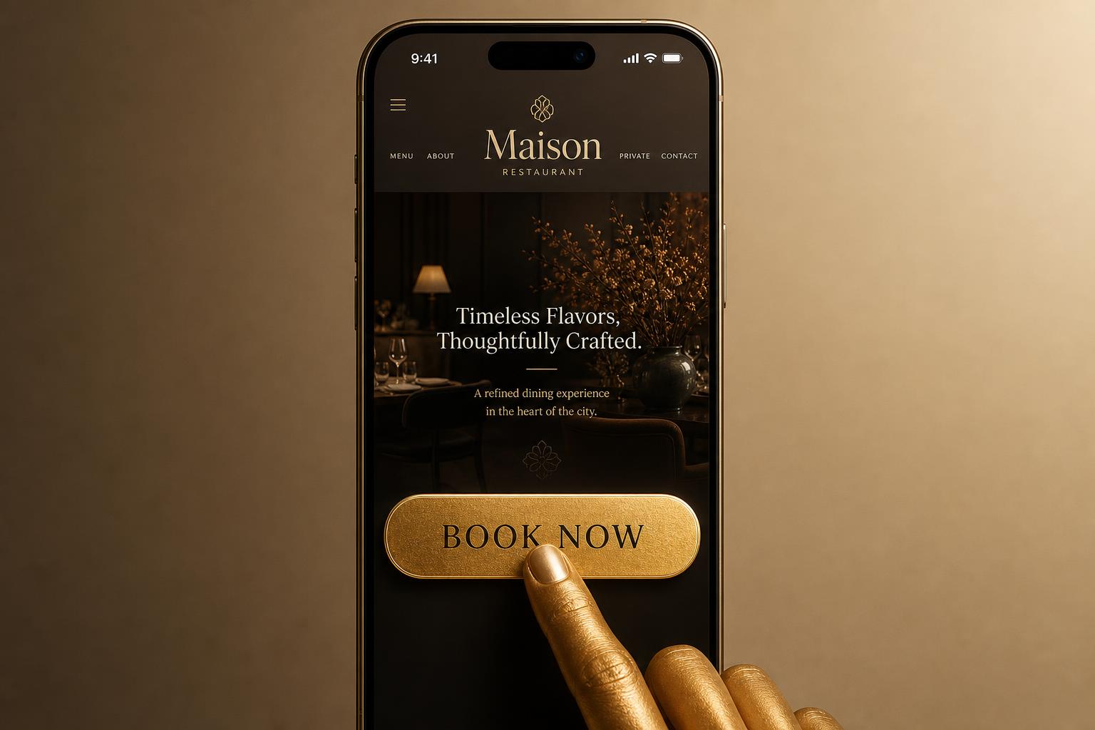
Many venues route booking traffic to a clunky third-party page, a phone number, or — worst of all — a contact form. Extra clicks can discourage your interested guests. Unclear steps can add friction; the effect depends on the visitor and context.
The fix: a clear booking path suited to your operation. A good third-party tool may be the best fit; a custom flow is not automatically better. Our date and party-size demo is simulated and does not create real reservations. Try the Reservation Flow demo →
Mistake #3 — No local authority signals
"Brunch near me" is a search from someone making a local decision. If your site doesn't mention your suburb, your chef's story, your suppliers, or your awards, you may miss opportunities to explain your local relevance. These details do not guarantee search rankings or customer trust.
The fix: bake local proof into every page — neighbourhood, produce origin, head chef bio, Google reviews and press mentions. Specificity can help people compare their options.
Mistake #4 — Mobile design treated as an afterthought
Many customers search on a phone while they are already walking down the street. Tiny tap targets, three-column desktop layouts squeezed onto a 375px screen, and pop-ups that can't be closed can make booking or contacting you harder.
The fix: design mobile-first. Big tap targets, thumb-friendly CTAs, phone number and "Book" sticky at the bottom of the screen, no auto-play video.
Mistake #5 — Beautiful site, zero analytics
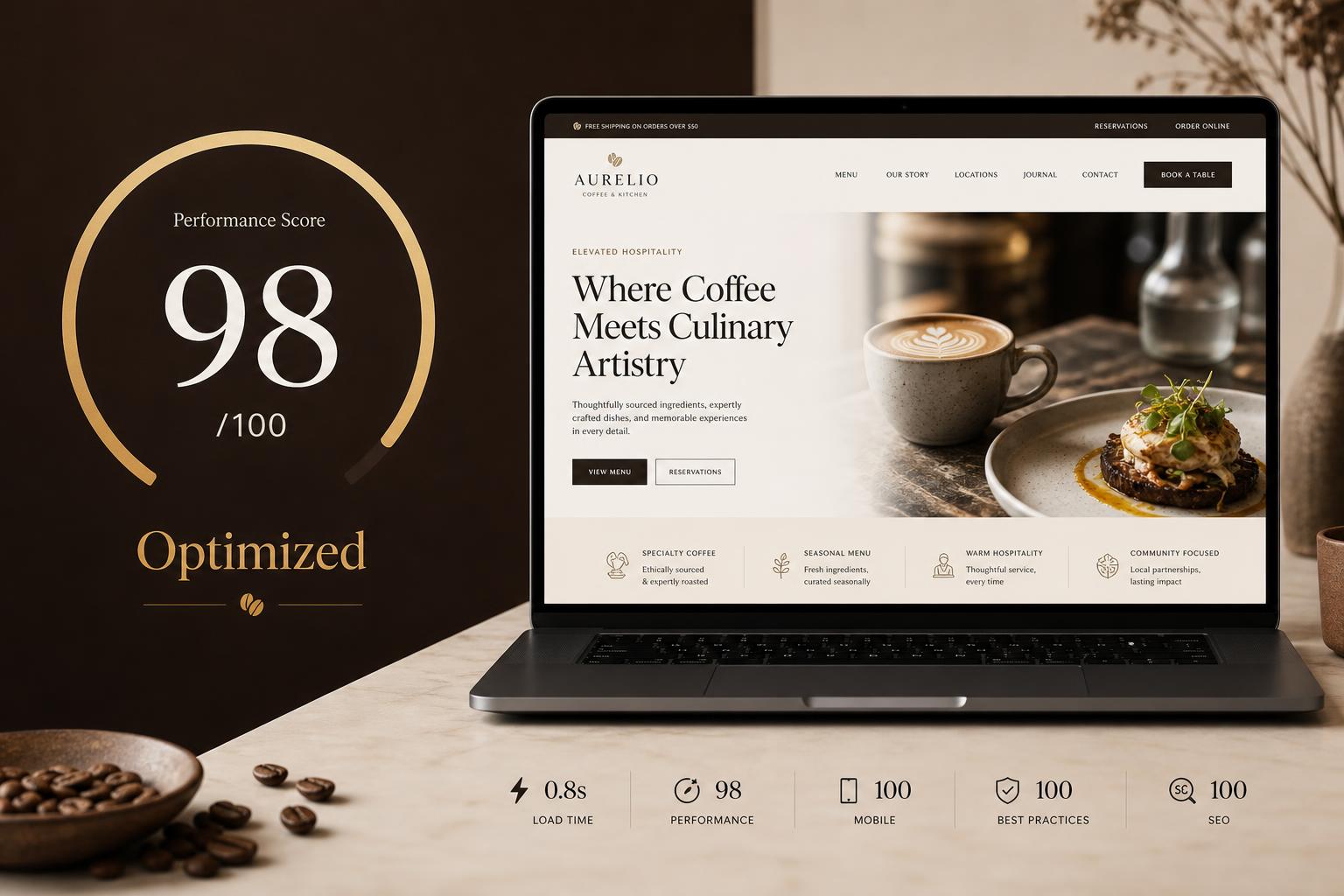
You wouldn't run a kitchen without a docket printer. Yet most venues launch a website and never check which page guests bounce from, which CTA they click, or which dish gets the most attention. Without data, every "redesign" is a guess.
The fix: install Google Analytics 4, track booking conversions as events, and review the funnel monthly. Use observed data to guide improvements rather than assuming a guaranteed revenue lift.

Bringing it all together
None of these fixes require a six-figure rebuild. They require a website that's been designed the way the best hospitality venues design their service: every touchpoint considered, every friction removed, every guest made to feel like the most important person in the room.
Share
Let’s talk for 15 minutes
We’ll review your business on Google and mobile and recommend only what you actually need.
Let’s talk for 15 minutes